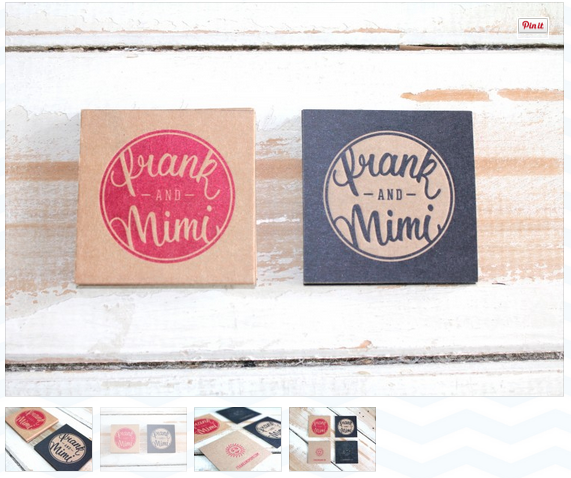
Recently I came across Little Peach. A company specialising in letterpress and in particular wedding invites and business cards. What drew me to the company was the physicality of the collateral, the business cards looked really nice to touch and I am learning that every element of the design improves the professional feel, not just the digital design. What is useful about the website is that the stock and production method are sometimes explained with each image, which is helpful to me to understand how to create something similar.
What is great about their designs is that they all have a handmade feel but remain sleek and professional. They are playful with their use of stock and use embossing/debossing for an extra touch. I am eager to stretch my designs to the next level at the moment and I feel that by using similar techniques I can achieve this.
Their website design is really friendly and incorporates their letterpress way of working. I particularly like the image they use on the homepage with white logo/symbols. I do however think the website would be improved as their are too many colours, patterns and typefaces which I do not feel show off the professionalism of their work.
Here are some examples of their work which inspired me...
 |
| Printing: One colour on K.W. Doggetts Buffalo Board 382gsm. Finished off with a coloured ribbon. |
 |
| Printing: One-Colour Letterpress Print on Crane & Co. Lettra 600 gsm with edge painting |
 |
| Printing: 2-Colour Letterpress on Buffalo Kraft 386gsm |

No comments:
Post a Comment